The
Nicoya Peninsula, located in the northweast of Costa Rica, is considered to be
an area of seismic importance, given its unique location, sitting right over
the seismogenic zone of large earthquakes within a subduction zone, a trait
shared by only 2% of the world’s
territory [13].
Since 1995, the Costa Rica
Volcanological and Seismological Observatory, at the National University
(OVSICORI-UNA) has performed active monitoring activities of the Nicoya
Peninsula using a geodynamic monitoring network to record deformations [5]. For
more over a decade, OVSICORI has maintained that the Nicoya seismic gap had the
potential to generate an earthquake with magnitude of moment magnitude (Mw),  .
.
This evaluation of the
seismic potential came true on September 5, 2012 when an earthquake of 7.6 Mw,
recorded at 8:42 a. m. Data from the GPS stations showed that slippage in the
fault reached an average of 1.85 meters of, approximately, 4 meters of
potential displacement that existed below the Peninsula; some small patches of
the fault moved up to  [12].
[12].
The objective of this
project was to develop various visualizations of the crustal movement produced
by the September 5th, 2012 earthquake in the Nicoya Peninsula based on recorded
data, reported in [12].
The reason why the Nicoya
2012 earthquake is considered to be one of the best documented earthquakes in
history is not due to the number of stations in Costa Rica, but the density
(distance between stations) and their relative location over the seismogenic
zone. “Japan has 1,000 stations, thereby outnumbering those in Costa Rica. Yet,
in Costa Rica, monitoring stations are located just above the fault” [13].
Although earthquake-monitoring
stations in the Nicoya Peninsula are more densely distributed than in the rest
of the country, visualizations require many more intermediate points. This
project defined a matrix of one point every kilometer at the latitude and longitude
axes where data was extracted from each station and interpolated on the plane
with data from neighboring stations to achieve data for every kilometer.
The deterministic Inverse
Distance Weighting (IDW) [16], which is based on a power of 4 method, was selected
to produce spatially continuous displacement maps in  ,
,  , and
, and  -axes based on all available ground-GPS
stations.
The IDW interpolation
method was chosen on the basis of: (a) previous use in literature, (b)
continuity of recorded data, (c) topography and geomorphology, (d) sparse
location and distribution of GPS ground stations (which prevented the use of
Kriging or other geospatial interpolation method) and (e) computational cost.
Spatial resolution remained a constant of 1000 m, mostly on the grounds of
computational costs.
Spatial data processing
was executed using the R programming language [14], along with specialized R
packages (mainly Gstat, Sp, Raster and Automap) [17-20]. All spatial products
adhered to the official Transverse Mercator projection system (CRTM05) [21].
After clean and homogenous data was obtained in the desired resolution, the
next step was the visualization design stage.
There
are different earthquake visualization studies, which focus on earthquake
animation from data recorded in a particular area of interest. For example, in Chourasia [4], the objective was to
estimate the movement of the crust during the San Francisco earthquake, which
occurred in 1906 and characterize the behavior of similar earthquakes for
various hypothetical scenarios north of the San Andreas Fault.
The work in [4], considers
various aspects of the interface allowing it to be more intuitive. For example,
it provides a rendering with an intensity that is more precise than movement in
real time with visual realism. Its system integrates color, texture and regular
mesh deformation while depicting rapid seismic wave dispersal. They recommend
simulation requirements that involve intuitive and precise earthquake
renderings. Chourasia provides
a visual representation workflow for ground motion data in a simulation of the
great 1906 San Francisco earthquake. The Chourasia tool considers aspects about the interface that
we also consider to be important. For instance, the system uses mapping
textures with a high degree of visual realism and integrates color to represent
shaking or movement intensity. The simulation represents the earthquake rupture
since it creates a dislocation, which propagates at the finite elements mesh.
Ground shaking is calculated by resolving the wave equation in three dimensions
for elastic material. This entire simulation is done in three dimensions and
includes topography of the terrain.
Despite similarities
between the aforementioned study and this study, the objectives are completely
different. The core idea of our study is to, intuitively, demonstrate how the
crust reacted to the earthquake so that viewers can better identify the
conditions of the ground beneath the subduction zone. Chourasia´s focus, on the other hand, uses the data
to simulate future movement and does not use visualization techniques to
understand the actual behavior of the studied area.
A study by Cheng-Kai et
al. [3] attempts to analyze how certain structures, such as bridges, respond to
earthquakes. This methodology is based on breaking down data into various
frequency bands in order to isolate and compare specific features. This
simulation considers various features of the surrounding bridge terrain to
maximize accuracy. Although these features are similar to our study, Cheng-Kai
focuses on civil structures, while our focus is the visco-elastic behavior of
the earth´s crust.
QuakeSim [8,10], is a
rather complex project. It was developed with the objective of better
understanding tectonic activity and the processes that occur during an
earthquake, a common objective for our project. QuakeSim incorporates various
instruments such as: database systems directed at research, a collaborative
portal and three known scalable parallel simulation codes: GeoFEST, PARK and
Virtual California. Even though
several tools are presented, the emphasis of the work is on the simulation of
the behavior of waves across the Earth's crust, the different models used for
these predictions and how the results look. For this reason, the crustal
deformations in its various parts are not evident in any of them, but rather
deepen in the underground behaviors of waves.
Castanie, Bosquet y Levy [1]
propose volume-rendering algorithms based on transfer function integration.
This system is dedicated to effectively encapsulating visualization of
different high-quality volumes in the rendered algorithm and the possibility of
visualizing iso-surfaces interactively and covering it with another attribute,
the basis of this visualization are seismic amplitudes below the ground surface
level. This project is alike the previous projects, they use simulation to
understand the seismic dynamic, while we have the same objective, but we reach
it through animation with real data.
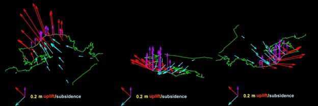
Finally, in 2013 OVSICORI/UNA [12] together with other institutions,
developed an animation of the 7.6 Nicoya earthquake that occurred in 2012 in
Costa Rica. The animation depicts the displacement field. This visualization
shows an animated image of the coseismic rupture as observed by GPS and Geomorphic
changes in the coastline (see figure 1).
However, even though it is a three-dimensional representation, only arrows with
considerable lengths are shown, that does not explain in any way what the
relationship is in the crustal deformations between the different parts during
the earthquake.

Fig. 1: 3D Coseismic
Displacement Field.[1]
The
target question was analyzed in order to develop the [6], thereby suggesting a
paradigm based on the visualization objective. After analysis of similar cases
and exploring various visualization paradigms, it was decided, along with
scientists, that the best option was to present three different types of visualization:
(1) 2D visualization of longitude and latitude displacement, (2) 2D visualization
of altitudinal movement and (3) 3D animation of both types of movement. For 3D
navigation, we use our customized approach of the conventional virtual trackball,
Virtual Sphere or Sphere View [15].
The entire visualization was programmed in the Processing[2]
programming language, which is a Java version, specially developed for visual
and media design. The 3D visualization engine of the Processing environment
(P3D) is based on OpenGLES, which is quite efficient in using large amounts of
data in 3D environments.
Before making the decision to use this environment, a
comparative study was made between JavaScript (with the 3D library Three.js),
Swift (Apple programming language) and Processing, the performance of the
latter was better by a factor of 10; details of this comparative study can be found by
[22].
To generate the geography of Costa Rica we used models in PLY
format (Polygon File Format) which is a simple format for handling 3D objects
used to store 3D scanner results. We used the ASCII version of this format with
geo-MsoNormald points with latitude, longitude (in degrees) and height (in
meters) [22].
For the navigation inside the 3D visualization environment, a
customized system of the “Virtual Sphere Navigation Paradigm” was used, which
is restricted to simplify the navigation problem in case of terrains [23].
The data of crustal deformation during the earthquake were
provided by the OVSICORI-UNA utilizing a geo-MsoNormald data table in CSV
format. CSV format is the most straightforward format for transferring data in
the form of spreadsheets or tables in ASCII. The tables have a matrix of 375×353 (132,375) points, which
represents one point per square kilometer in Costa Rica, between the longitudes
of [-86, -82.6] and latitudes [8,11.3] where our country fits comfortably.
The rendering technique used for this tool is not very demanding
because the geography must have a chromatic code according to the magnitude of
the deformation and not according to some lighting or general shading
environment. In this way, the wireframe technique is used for displaying nodes
with a color-code according to the intensity of the displacement.
Each
two-dimensional visualization represents an important earthquake
characteristic. The first visualization showed latitude and longitude movement,
which reflected the direction and magnitude associated with movement of that
area during the minutes that the earthquake lasted.
Fig. 2 shows the entire
country. The background color codes movement intensity. The darker the color,
the larger the displacement. In that same visualization, the arrows represented
movement magnitude and its direction. The longer the arrow, the greater the
displacement. Also, the figure exhibits three cursor positions showing
magnitude and displacement direction at that point.
Fig. 2: Two-dimensional
visualization of latitudinal and longitudinal displacement
Fig. 3: Two-dimensional
visualization showing upwards or downwards displacement of different areas in
the country
Fig. 3 shows the map of
Costa Rica divided into two large areas – a grey and reddish-yellow zone. The
grey zone represents the part of the country that experienced ground sinking
from the earthquake (subsidence: reduction of height above sea level). The
darker the grey, the deeper the ground sunk. The reddish-yellow zone shows
those regions in the country that were lifted by the earthquake. The darker the
red, the greater the height. Conversely, as the yellow becomes lighter, the
lower the impact on ground height.
The
second type of two-dimensional visualization chromatically encodes upwards and
downwards displacement of the earth´s crust during the earthquake.
Again, the figure has four
positions of the mouse to show how the dashboard moves and better understand
vertical displacement at each point.
A
third type of visualization is developed in three-dimensions of horizontal and
vertical movements simultaneously (Fig. 4), that is, the actual
three-dimensional movement throughout the country. This animation depicts the
movement produced for the energy accumulated in the last fifty years and released
in the event on September 5th.
Fig. 4: 3D animation
showing entire movement of the country during the two minutes of the
earthquakes and its 5 dashboards
To
evaluate and further guide the design of our visualization we conducted a user
study through which we define, together with the seismologist of OVSICORI, a
few user cases to test.
After
several discussions with the domain scientists, the target question for our visualization
was to, clearly as possible, show the relationship between the different displacements
that occurred during the quake.
To achieve this goal, a
cursor in the form of two “targets” (see Fig. 2) was designed for latitude and
longitude displacement. The user can use the mouse to move the cursor over any
visualization point and the two targets will move according to the displacement
experienced in that area during the earthquake. This reflects the direction and
gives a good idea of the magnitude. In addition, a numerical indicator is
displayed to show combined displacement in centimeters.
Scientists use this
visualization to obtain an overall picture of all of the information. The
distribution of the arrows is particularly important in magnitude as well as in
direction. Although, it is readily visible that the country is divided into two
regions, the northern region affected by the subduction of the Cocos plate
under the Caribbean plate and the southern region where the Cocos plate
subducts under the Panama Block. This scenario is clear when it is understood
that the behavior of the arrows also changes in both regions. This shows that
horizontal movement in the Northern Region is much greater than those in the
Southern Region. This is due to the fine extension of the earthquake´s
rupture area.
The
following case visualizes sinking and rising of areas throughout the peninsula.
In the same work process as in the previous case, we discuss with seismologists
the better way to obviously show in the visualization the movements up and down
of earth’s crust. The solution was similar, a color code for surface and new
cursor to have the data in centimeters.
Also, another cursor was
designed to visualize this type of motion. The cursor is a vertical scale that
moves upwards or downwards according to the displacement of the point (Fig. 3).
Color-coding was used with
red to represent ground elevations and blue for ground that subsided. In this
manner, data could be visualized more intuitively with less of a cognitive
burden, given that even the movement of the dashboard is in the same direction
as the movement visualized.
Another advantage of this
type of visualization for scientists is that the inflection line can be seen
within the country. The
“inflection line” marks the limit between the territory that was uplifted from
the one that experienced subsidence. The colors clearly show this line through the peninsula and shows how most
of it is located in firm ground, a phenomenon that is present in only 2% of the
areas throughout the planet where faults are found [13]. As a result of
interpolation among the station data, it is possible to graphically view an
approximation of this line throughout the country.
As
was previously stated, a three-dimensional animation was executed to analyze
different displacement perspectives of the Nicoya Peninsula during the 50 years
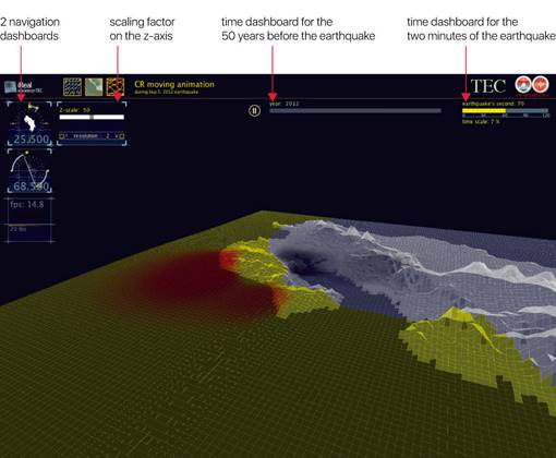
and the two minutes of the earthquake separably. Fig. 5 shows the dashboards
available in the animation: Navigation, Resolution, Z Scale, Animation Time Data and
Frame Rate.

Fig. 5: Several
dashboards on the animation
For
3D navigation, we use our customized approach of the conventional virtual
trackball, Virtual Sphere or Sphere View [15].
In this case, the arrow
keys are used to rotate and certain letters are used for close-ups and panning.
In addition, there are two dashboards that show the incline of the animation as
well as the North-South direction, as is the case in vertical rotation. See
Fig. 5.
This feature of the
animation was very useful for scientists since displacement, from all
perspectives, can be perceived more intuitively and they can understand the
exact movement of the earth´s crust in these crucial moments.
A
dashboard was implemented to be able to modify the movement scale in the
Z-axis. It is obvious that at no point in time, movement in the Z-axis can be
animated to a real-life scale, since the highest displacement was under 70
centimeters. Although this is lengthy for a peninsula, it is not visible in an
animation in real-life scale. This
allows scientists to see more clearly the relationships between the
deformations in different parts of the peninsula.
Animation initially runs
from a Z scale of 1:50 that can be adjusted to 1:100 using the slider.
Scientists may increase the movement of Z from 50 to 100 in a continuous
manner, thus allowing a better understanding and view of movement relationships
throughout the different regions in the peninsula.
Although not a true to
scale, movement relationships are present, such as, an area that sinks while
another is elevated or a part that is displaced more towards the south while
another area moves towards the west. This is the type of target question that
the dashboard helps respond.
This feature was so well
received by scientists that they may implement it for other displacements in
future visualizations.
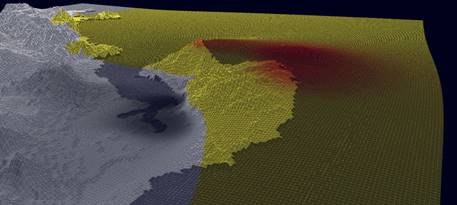
The
animation was developed on a grid pattern in order to show the extent of the
movement and the direction of the deformation. This was a particular request
from scientists since it explains why certain parts of the country sink when
they are “stretched” or “pulled” by the detachment of other regions, as is
shown in Fig. 6.

Fig. 6: Deformation of
the original grid during a specific movement of the earthquake
After many additions and
adjustments in the visualization with the observations of the scientists, they
coincide in the utility of the animation: “Crustal deformation is the elastic
response to strain accumulation and visco-elastic deformation results from
sudden stress drop. The first is very slow and the seconds fast; both are quite
small to represent in real time as time series”. Other induced crustal
deformation could also occur and be only recorded with GNSS (Global Network
Satellite Systems such as GPS). In many cases these deformations occur on very long-time
scales and are even difficult to deduct from regular time series of daily GPS
solutions. Under these conditions, having a visualization tool that allows for
both, magnification of the signal as well as acceleration of time, permits
identify events that otherwise could be missed by the scientific community.
This
type of earthquake visualization offers an array of possibilities, such as
using the same techniques for other earthquakes or geographic areas for
purposes of examining a specific technique more in depth. Two-dimensional
latitude and longitude displacement visualization is already scheduled for
2017-18. However, this time the visualization will not be limited solely to an
earthquake, but to movement of the entire country for one year with time, speed
and geographic filters. This project arose as a reaction from seismologists
after viewing these types of current visualizations. The controlled
acceleration of the motion will also permit the visualization of slow-slip
events that occur over several weeks and do not leave a record on seismograms.
The possibility of viewing
all data in a single view and being able to compare the different parts of the
peninsula simultaneously with regards to the specific moment of movement during
the earthquake has been welcomed by scientists who regard visualizations as a very
simple summarized method of understanding the complex mechanics of an
earthquake.
In the other hand, the environment in which the tool was developed
is multi-platform and can be co-worked in Linux, Windows, and macOS, in the
same way, it can generate applications to run on all three operating systems.
The whole system automatically adapts to the data, even the camera
takes the average longitude and latitude of the data provided and positions
itself in the middle of the analyzed area with a height defined by the width of
the geographical area so that the camera can visualize the entire area. In this
way, any data group, or any geographic area can be viewed and analyzed by the
tool by merely changing the CSV files.
We opted for this parameterized programming scheme to be able to
visualize other earthquakes easily, since in Costa Rica they are frequent, as
well as earthquakes in other areas of interest, such as the Caribbean or the
Pacific Ring of Fire, all of which are seismically related to our country.
As
a tool developed in a public university in Costa Rica, it is open to
collaborating with any other university or research center to help in the
analysis of an issue so relevant for countries suffering from seismic activity.
We
wish to thank the Volcanological and Seismological Observatory of Costa Rica at
National University, OVSICORI (http://www.ovsicori.una.ac.cr), We would also like to thank
the scientists who provided assistance as consultants, testers, and advisers.
[1] Castanie, Laurent, Fabien Bosquet, and
Bruno Levy. "Advances in seismic interpretation using new volume
visualization techniques." first break
23.10, 2005.
[2] F. H, Castro, E. M., Montero & J.M, Fallas. Biovisualizador:
Visualizando los anfibios de Costa Rica. Tecnología en Marcha,
22(1), 15-23, 2009.
[3] C. K Chen, C. Ho, C. Correa, K.L Ma, & A.
Elgamal. Visualizing 3D earthquak.e simulation data. Computing in
Science & Engineering, 13(6), 52-63, 2011.
[4] A. Chourasia, S. Cutchin & B.
Aagaard. Visualizing the ground motions of the 1906 San Francisco earthquake. Computers &
Geosciences, 34(12), 1798-1805, 2008.
[5] V. González-Salas
& J.M Protti-Quesada. Afinamiento del potencial sísmico y
monitoreo de la brecha sísmica de Nicoya. Ambientico., (147), 12-15, 2005.
[6] F. Hernández-Castro, J.
Monge-Fallas. What for: classification of visual paradigms. PONTE:
International Scientific Researches Journal, 72(7), 46-64, 2016.
[7] LAS, O. R. P. TERREMOTO DE NICOYA.
[8] P. LI, Peggy; SIEGEL, Herbert.
Visualization of Earthquake Simulation Data. En Proc.
of NASA Earth Science Technology Conf. 2004.
[9] Ovsicori (2012).
Terremoto de Nicoya era el esperado, sin embargo, queda potencial sísmico en la
región. Comunicado de prensa B.P. OVSI-016. http://www.ovsicori.una.ac.cr.
Accessed
15 December 2016.
[10] PI, C. D., Mallios, J., & Tullis,
T. Visualization of Earthquake Simulation Data, 2004.
[11] Protti, M., Güendel, F.,
& Malavassi, E. Evaluación del potencial sísmico de la
Península de Nicoya:
Heredia. Costa Rica, Editorial Fundación UNA, 2001.
[12] M. Protti, A. González,
T. H Newman, S. YDixon, J.S Schwartz, L. Marshall, J. I Feng, R. Walter, R. S.E
Malservisi, Owen, Nicoya Earthquake Rupture Anticipated by GPS Measurements of
the Locked Plate Interface, Nature Geoscience 7(2), 117-121, 10.1038/ngeo2038,
2014.
[13] M. Soto. Costa Rica es ‘epicentro’ ideal para
el estudio de temblores. La Nación. 22.02.15. http://www.nacion.com/tecnologia/avances/Costa-Rica-sitio-investigar-temblores_0_1471252910.html. Accessed 10 December 2016.
[14] Team, R. C. (2014). R: A language and
environment for statistical computing. R Foundation for Statistical Computing,
Vienna, Austria. 2013.
[15] J. Monge-Fallas & F., Hernandez-Castro.
An Intuitive 3D Interface for Defining Seismic
Profiles by Plinius. PONTE:
International Scientific Researches Journal, 74(4), 2018.
[16] O. Babak &
C. Deutsch. "Statistical approach to inverse distance
interpolation." Stochastic Environmental Research
and Risk Assessment 23.5 (2009):
543-553.
[17] Hiemstra, Paul, and Maintainer Paul Hiemstra. "Package
‘automap’." compare 105 (2013): 10.
[18] Pebesma, Edzer, Benedikt Graeler, and Maintainer Edzer
Pebesma. "Package ‘gstat’." (2018).
[19] Hijmans, R. J., van Etten, J., Cheng, J., Mattiuzzi,
M., Sumner, M., Greenberg, J. A., ... & Ghosh, A. (2017). Package ‘raster’.
[20] Pebesma, Edzer, and Roger S. Bivand. "Classes and
Methods for Spatial Data: the sp Package." R news 5.2
(2005): 9-13.
[21] E. Grafarend. "The optimal universal transverse Mercator
projection." Geodetic Theory Today. Springer, Berlin,
Heidelberg, 1995.
[22] F. Hernández-Castro & J., Monge-Fallas. Visualizador 3D
de la geografía de Costa Rica. Revista Tecnología en Marcha,
29(8). (2016). 77-85.
[23] F. Hernandez-Castro &
J. Monge-Fallas. Navigation Sphere: Optimizing Virtual Sphere
for Terrains Analyses . PONTE: International Scientific
Researches Journal, 74(7), 2018.

