It is an
obvious fact that the amount of data that needs to be analyzed when making
management decisions greatly grows every year. At the same time, a man remains
responsible for the analysis and final decision, that is, they depend on the
decision-maker (DM). Modern decision support systems (DSS), based on
mathematical methods, can partially replace human resources at the stage of
processing initial data, but not at the stage of final decision-making. The
lack of clear and structured information during the decision-making process
makes it difficult, due to processing data of various nature, frequency of
information updates over a short period of time, while the support and
decision-making is always left to DM. Due to this need for operational
research, it is required to provide high-quality visualization of constantly
growing and developing volume of data that rapidly appears as a result of
global scientific research around the world [1]. Range of research that
actively involve the visualization as a mean of interaction with any type of
data is constantly expanding. In turn, this leads of course to a significant
increase in data volume, complexity of their structure, the use in the analysis
of new data types as auxiliary or even major, information sources [2].
It is
especially important to develop visualization methods if we deal with analyzing
unusual data, dynamically changing over time. In this case, visualization methods
are faced with a very important and not easy task of visual and intuitive
display of unrolling a certain value change over time, showing the nature of
this change, analysis and cooperation with the accepted solutions, the result
of these solutions. To do this, visualization types such as graphs, bar charts,
and histograms are used.
However, the
situation with visualization can become very complicated if the quantity is
multicriteria [3] or consists of several components. In certain cases, it is
useful and very important for DM to analyze not just the change in the observed
value, but also the impact of measures taken on the structure of its
components, the dynamics of changes in the structure and the contribution of
components. This article is devoted to the visualization of such data.
To begin with,
we introduce a formalized concept of a structured value. This paper will
consider the issues of visualizing the dynamics of changes in such data.
Let us
introduce the concept of a structured value, the visualization of dynamic
changes in which we will consider in this paper. Let's suppose we have some
observed value
P. This value includes several components
ki:
|

|
(1)
|
Thus, the
observed value
P
is decomposed into a number of components. And from the
point of view of visualizing such values, two cases can be distinguished:
•
P
value is decomposed into a small number of components (less than 5);
•
P
value consists of a large number of components.
Both of these
cases are identical in terms of mathematical description, but have significant
differences in visualization. If a small number of components a person is able
to visualize and see their structure, then in the case of a large number visual
representation becomes more difficult and visual analysis becomes more complex.
Let us call the value described above structured. In this case, the dynamics of
changes in the structured value will be represented by such a dependence, in
which at each specific moment
tj
the value
P(tj)
will be defined as the sum of the components
ki(tj):
|
|
(2)
|
This paper is
devoted to visualization principles of this dynamics and these values.
Let's look at
practical situations where visual analysis of structured data dynamics can be
very useful.
During the
quarantine period of the first half of 2020, a group of students and teachers
at Bryansk State Technical University was engaged in constructing COVID-19
distribution models in AnyLogic. At the same time, a number of modeled and
observed values were just composite and had the character described above.
One of the
most important and critical indicators of spreading COVID-19 is the number of
infected people (let's call it
INF). It is this indicator that primarily
determines quarantine measures, the complexity of epidemic control in a
particular region, and various management decisions [4,5]. To display and
visually analyze the dynamics of changes in the number of cases over time, you
can use the classic method of displaying the curve as a function graph.
However, as
practice has shown, the total number of cases in a particular region (or even a
country) does not adequately describe the situation. Even if this value is
normalized by the region population (that is make the value relative), this is
clearly not enough for the analysis. The fact is that
INF
value itself
is a composite one by its nature and its constituent parts have quite different
degrees of criticality and importance. For example,
INF
value can be
decomposed into such components as the number of seriously ill patients
(requiring connection to an artificial lung ventilator), the number of
moderate-severity patients, and the number of patients who do not require
hospital admission. Therefore, the same
INF
value in different regions
may show the overall situation in completely different ways. To understand the
situation correctly, it is important to see not only the indicator itself, but
also the structure of its components, and evaluate the contribution of each
component.
Besides, if
the number of components is not very large, we can use traditional schemes for
displaying and visual analysis, such as multiple graphs (for each criterion
separately), column graphs, histograms and Temporal Networks. In recent years,
the research community has also accumulated overwhelming evidence in favor of
complex and heterogeneous connectivity patterns based on Temporal networks [6].
However, the situation becomes more complicated if the number of components
increases. In this case, the visibility of traditional approaches is greatly
reduced and attempts are being made to develop new methods and approaches in
this way [7].
Let's take
another example. According to the World Health Organization (WHO), the
incidence and severity of the disease in COVID-19 depends very much on the age.
Therefore, it can be very useful to analyze the number of cases (INF
indicator introduced before), but only in the context of the age of cases. That
is, the components of this indicator should be considered as the number of
cases of what age contributed to the total number of cases. This indication and
analysis can be useful for evaluating actions and decisions taken. For example,
some restrictive measures may not lead to a decrease in the total number of
cases, but may change the structure of this value, reducing the number of
elderly patients, which is also a very important factor in the epidemic control
[8].
At the same
time, visual analysis by age is very time-consuming. It is difficult to
estimate this indicator due to the large number of age options. Therefore, in
most cases, reduction of the variants (components) is done by rounding the age
to certain ranges [9]. An example of such rounding, taken from official
statistics on age, gender, and disease, depending on the death of patients from
infection caused by COVID-19 is shown in Table 1. The data are based on an
official document dated February 28, 2020 from the WHO-China Joint Mission
report [10].
Table 1. WHO-China
Joint Mission data of depending the disease on the age
|
Age
|
Number of infected people
|
Number of deaths
|
The likelihood of death from COVID-19
|
|
0-9
years
|
416
|
-
|
-
|
|
10-19
years
|
549
|
7
|
0,2%
|
|
20-29
years
|
3619
|
1
|
0,2%
|
|
30-39
years
|
7600
|
18
|
0,2%
|
|
40-49
years
|
8571
|
38
|
0,4%
|
|
50-59
years
|
10008
|
130
|
1,3%
|
|
60-69
years
|
8583
|
309
|
3,6%
|
|
70-79
years
|
3918
|
312
|
8,0%
|
|
80+
years
|
1408
|
208
|
14,8%
|
In the example
given the age of patients is divided by 10 years. However, such rounding is
associated with certain problems. Firstly, poorly chosen age ranges can lead to
incorrect analysis and a strong distortion of the real situation. Secondly, by
rounding up age ranges, we lose some of the information for analysis, which can
be very significant. Thirdly, the selected ranges may vary greatly for
different regions and countries, and to make the selection in each specific
situation is a very time-consuming task [11]. Therefore, the important point is
not to abandon the full range of ages, but to develop new principles for
visualizing such data, which will take into consideration all the data in their
original regardless of their gradation and components.
There are a
lot of ways to show the dynamics of data changes. Let us consider the most
commonly used options by the example of dynamics of developing COVID-19 on the
territory of Bryansk region. The graphs show the dynamics of infections,
recoveries, deaths due to COVID-19, the dynamic number of new infections,
identified on the territory of Bryansk region, compared with the previous day
and according to days since the first revealed infected person.
The most
common option for displaying these data is to use traditional charts. In this
case, time is X-axis, and the value under consideration is Y-axis (see Fig.1).
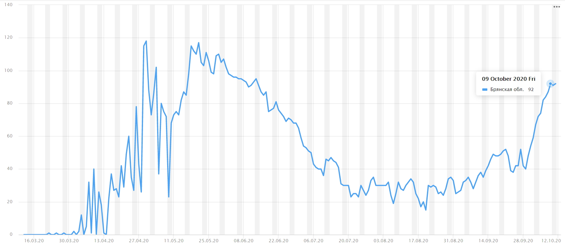
Fig.
1. The graph of changes in the number of cases of COVID-19 per day
If the data
are structured, then several graphs are constructed for each of the components.
An example of such graphs is shown in the first diagram of Fig. 2.
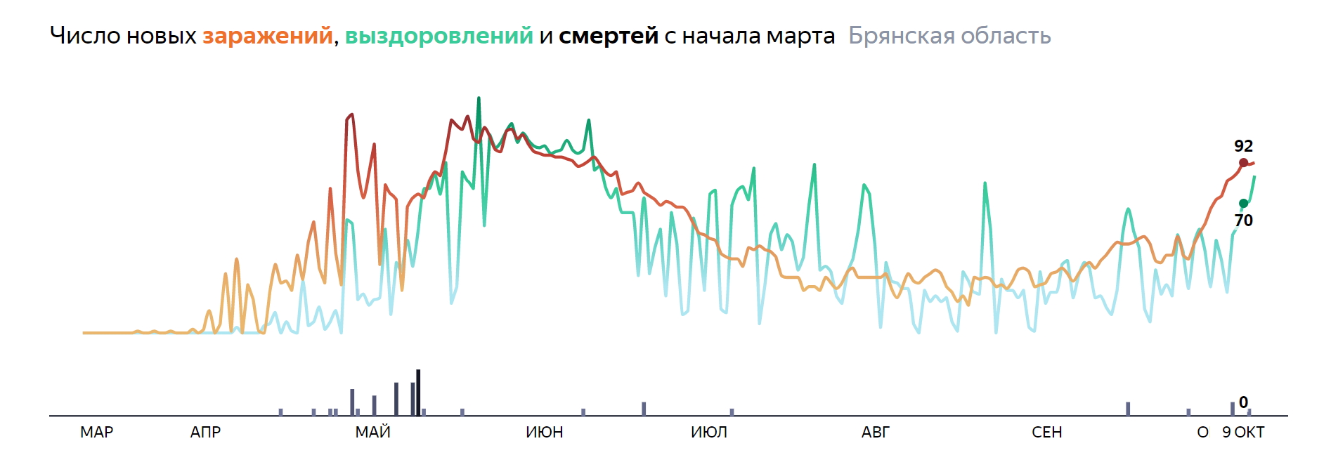
Fig.
2. The number of infected, recovered, dead people from COVID-19
However, it is
good to analyze such graphs if the number of the observed values is small
enough (one or two). If there are a lot of such values, the graph is difficult
to read and it becomes very hard to draw any conclusions in this situation.
Another problem is the difficulty of estimating the contribution of each
component to the total. Based on such render methods, it is often impossible to
analyze the overall situation of the epidemic growth in terms of the patient's
age, gender, , concomitant diseases , activities, etc. [12].
Another
option, which is also often found in open sources of statistics, is a column
chart. In this case, each component is displayed as a separate column of its
own color, and the dynamics is displayed as a set of such columns. According to
Yandex, Apple and Otonomo data, there is given an example of a column chart
grouping changes in the level of activity of the Russian population in the
period from February to June (see Fig.3).
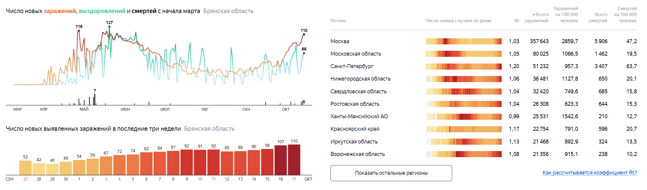
Fig.
3. Charts rendering the dynamics of COVID-19 in Bryansk region
Another fairly
good rendering option is a radar chart and a pie chart [13]. In contrast to the
previous versions, these methods are very good at visualizing the data
structure, clearly showing the contribution of each component. However, they
are very difficult to apply for showing the dynamics of changes in this data
over time.
Epidemic
outbreaks in various regions represent a special situation with a high level of
uncertainty. In some regions, there was a noticeable repetition of the
situation in the same scenario. In others, the situation was significantly
different. A software package in AnyLogic environment was developed in Bryansk
State Technical University [14]. The authors suggested using several modeling
directions. The mixed simulation model was based on a combination of
approaches: discrete-event directed modeling, agent-based modeling, and the
system dynamics section. The use of classical approaches to epidemic modeling
based on SEIRD model was proposed as the main method [15]. SEIRD disease
distribution model belongs to a class of so-called compartmental models, the
essence of which is to divide the population into several groups, i.e.: S
(susceptible) means the number of people susceptible to the disease, E
(exposed) is a group of infected people who are in the incubative stage, I
(infected) means infected, R (recovered) stands for the number of people who
recovered after the infection, D (dead) is dead. Each of the specified
parameters forms variables that are part of a system of differential equations,
which can be used to predict the dynamics of the epidemic.
As a result of
analyzing a series of experiments conducted with COVID-19 disease development
model it is possible to visualize the rate of infection spread with different
behavior of people and various parameters, conditions and constrains. The
screenshot of the system is shown in Fig. 4. The system was presented at the
contest for the best scientific work "Modern scientific achievements.
Bryansk-2020".
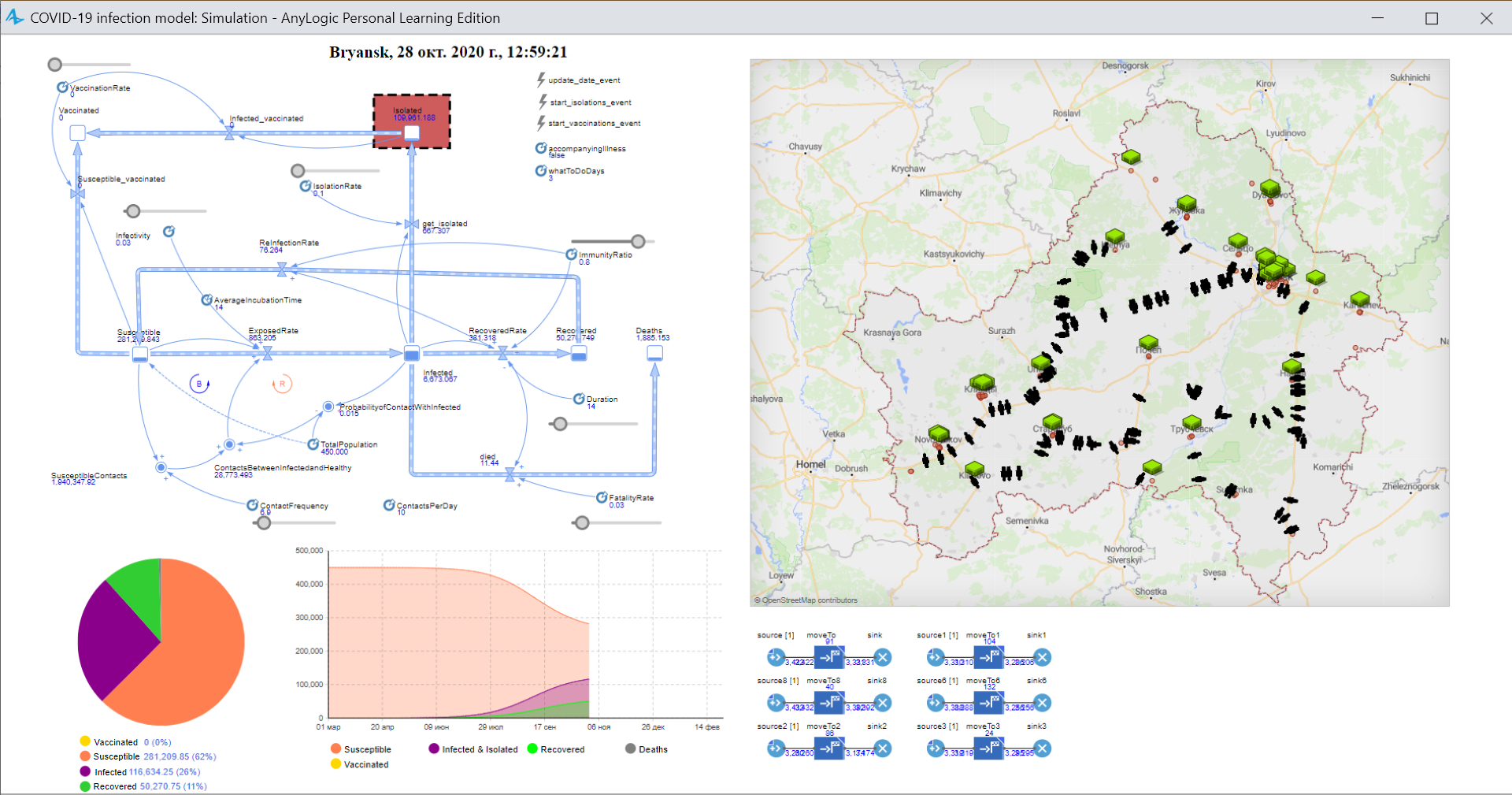
Fig.
4. System of modelling COVID-19 in Bryansk region
Taking the
known criteria as a basis, it is possible to demonstrate the development of
infection spread, indicators of the level of disease severity [16]. We used a
model that incorporated the main factors known at that time about the spread of
infection among people. Specific indicators and coefficients were calculated
based on similar data for Moscow region [17] and included in the complex for
modeling the situation in Bryansk region. As a result, a model was built (see
Fig. 5) that takes into account the following factors of COVID-19:
1.
Immunity. The better the
person's immunity, the lower is the probability of COVID-19 infection (
ImmunityRatio
parameter of
double
type, which takes value from 0 to 1). Each object
Person
in the constructor is assigned with a random value in the range specified
above.
2.
Social responsibility (IsolationRate
parameter of
double
type has a default value of 0.45) [18]. According to
the emergency response centre of the Russian Federation, the level of social
responsibility is approximately 45% (exactly following the doctor's
prescription and recommendations, as well as quarantine or self-isolation
measures). The value of this parameter changes dynamically based on data
received from Rospotrebnadzor (Russian Federal Service for Surveillance on
Consumer Rights Protection and Human Wellbeing) and Johns Hopkins University.
3.
ContactsPerDay
parameter defines the
average number of close contacts of the object
Person
per day.
4.
The probability of
contacts between people with different degrees of infection: the probability of
contacts between infected people and healthy people (ProbabilityofContactWithInfected
parameter), the frequency of contact, and maintaining social distance (ContactFrequency
parameter).
5.
Accompanying coronavirus
diseases (factor of a person's going to the hospital in case of infection,
accompanyingIllness
parameter of
boolean
type).
6.
The time to make a
decision after infection symptoms onset is a factor that can be used to make a
conclusion about the disease severity (whatToDoDays
parameter is of
int
type and is set randomly from the above range for each object
Person).
According to statistics in the region [19], a person goes to the hospital or
goes to self-isolation within 1-5 days. In this time range, a person begins to
notice symptoms onset and deterioration of his health condition.
7.
Mandatory self-isolation
of people (start
_isolations_event, if the threshold of sick people is
exceeded, as well as based on data from the period of self-isolation in Bryansk
region and orders of authorities –
intervention).
8.
The probability of virus
spread is
InfectionProbability
parameter. The probability value depends
on several factors, such as the use of personal protective equipment, wearing
masks, washing hands, or touching the person's respiratory organs and mucosa.
Based on the
tasks and factors that affect the development of the spread of Covid-19
infection, the model is built using a system of differential equations
described below:
where:
ExposedRate
is the number of sick people per unit of model time,
Susceptible
is the
number of people susceptible to infection with Covid-19 (taking into account
factors such as weakened immunity, being in public places of large crowds,
etc.),
ContactsBetweenInfectedandHealthy
is the average number of
contacts between infected and healthy people,
Infectivity
is the
probability of infection during the spread of an epidemic,
InfectionRate
is the rate of the disease progression,
AverageIncubationTime
is the
average value of the incubation period,
RecoveredRate
is the number of
people who set recovered from an illness (the absence of a virus in the body
during testing) per unit of model time, Infected
– infected people,
Duration
– mean time of disease progression,
FatalityRate
– number of people who
died per unit of model time,
Died
– percentage of mortality (probability
of death based on patient statistics).
The structure
of the simulation model of the disease development according to the unit of
model time equal to one day is shown in Fig. 5.
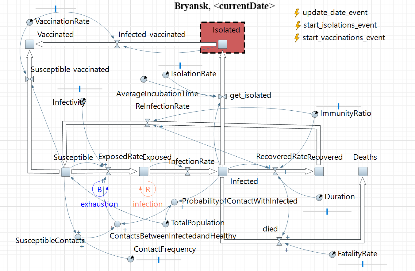
Fig.
5. System Dynamics Model of the spread Covid-19
The color
marker approach described below was used to display and visualize data on the
dynamics of changes in structured values. This made it possible to present the
results more clearly.
The data on
the infection spread in Bryansk region obtained during modeling on the basis of
open and publicly available information shows the feasibility of the model. The
discrepancy between the currently modeled and real curves does not exceed 8%.
As it was
described above, in the framework of research and simulation of the situation
with spreading COVID-19, conducted in Bryansk State Technical University, we
used an approach to show the dynamics of changes in structured values, which is
conventionally called the method of color stripes or color marker graph. The
main idea of this approach is as follows. Let us assume that we have a certain
value
P(t), which value changes over time (the value under study
depends on t parameter). In this case, this value consists of different
components. That means that at t time moment
P(t) value can be
decomposed into some components:
|
|
(3)
|
For visual
image of these data (both the graph of changes in the value itself and its
components), we assign each component part
kj
a certain color
(the so-called color marker):
|

|
(4)
|
Then the curve
of the value change
P(t) is rendered as a standard graph,
plotting time along the abscissa axis, and the observed value itself along the
ordinate axis. At the same time,
kj(t) component parts
should be painted with the corresponding color marker. In this case, the graph
of changes
P(t) will look like color bars of different widths
(depending on the value of
kj(t) components).
Now let us
consider the example described in the previous chapter (analysis of changes in
the number of cases in the context of disease severity). Let the analyzed value
P(t) be the total number of infected by COVID-19 at a certain
time (INF
value introduced above). At the same time, as it is described
above, not the graph of changes in the number of cases is of interest, but the
analysis of the components of this number, that is how many of these cases are
severe, how many are moderate, how many people do not require hospital
admission, and how many are asymptomatic. In this case this value at time
moment ti is decomposed as follows:
|
|
(5)
|
where:
k1(t)
is the number of seriously ill at time moment
t;
k2(t)
is the number of hospital moderate-severity patients;
k3(t)
is the number of infected people who do not need hospital admission;
k4(t)
is the number of asymptomatically infected.
Let us assign
a color marker to each value. Then the general graph of changes in the
epidemiological situation will take the form shown in Fig. 6.
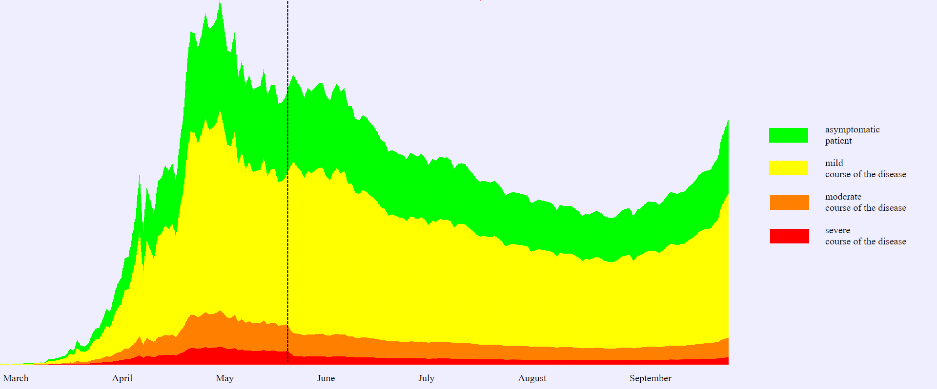
Fig. 6. Graph for showing
a structured value in the form of color markers in the context of disease
severity
This graph is
a more visual way to show than tabular data or other options discussed earlier.
This display provides more information for analysis and additional conclusions,
allows to see patterns or effects that are not visible in other versions of the
image.
A distinctive
feature of displaying with color markers is that this method allows decision
maker to perform visual analysis that was previously unavailable when
displaying as a regular graph. For example, Fig. 6 shows one feature according
to the graph given. At time moment
tk
marked on the graph with
a stipple line, some measures were taken that did not significantly reduce the
increase in the total number of patients and significantly changed, the spread
of COVID-19 (INF
value graph saves its nature). However, the decisions
made at this moment allow to change the structure of
INF
value
significantly in the direction of reducing the number of seriously ill (k1)
and moderate-severity (k2) patients which is more important
than general trends of the target indicator. Fig. 6 shows these changes and
gives the opportunity of visual analysis and search of similar periods. For
example, the exponent form of the curve on the graph of epidemic development
under normal conditions. This form determines the rapid growth of morbidity
rate, which in turn greatly increases the burden on health authorities, thereby
increasing mortality due to the lack of proper medical care and appropriate
equipment. When a person's social activity decreases by five times
(self-isolation), there is a smooth evenning of the curve on the graph. This
scenario increases the overall duration of the epidemic, but reduces the burden
on health care, thereby reducing the number of patients who died. However, in
the example given above (Fig. 6) there is a number of difficulties which make
the visual analysis of the structure harder to realise.
These difficulties include:
·
in
areas with a low
INF
target value, the color marker bars become narrow
enough that any changes in them are not visible;
·
in
areas with a sharp change in the target value of
INF, a jump in the
target indicator makes it difficult to analyze visually
ki
components included in it.
In order to
overcome these difficulties we suggest switching from absolute numbers to
relative ones, i.e. construct color bars in a normalized variation:
|
|
(6)
|
|

|
(7)
|
In such
variant the fluctuations of the target indicator or a small value will not make
it difficult to perceive the structure. The analysis of changes in the
structure becomes even clearer and any changes or external influences that
displace the internal components of the value become clearer (see Fig. 7).
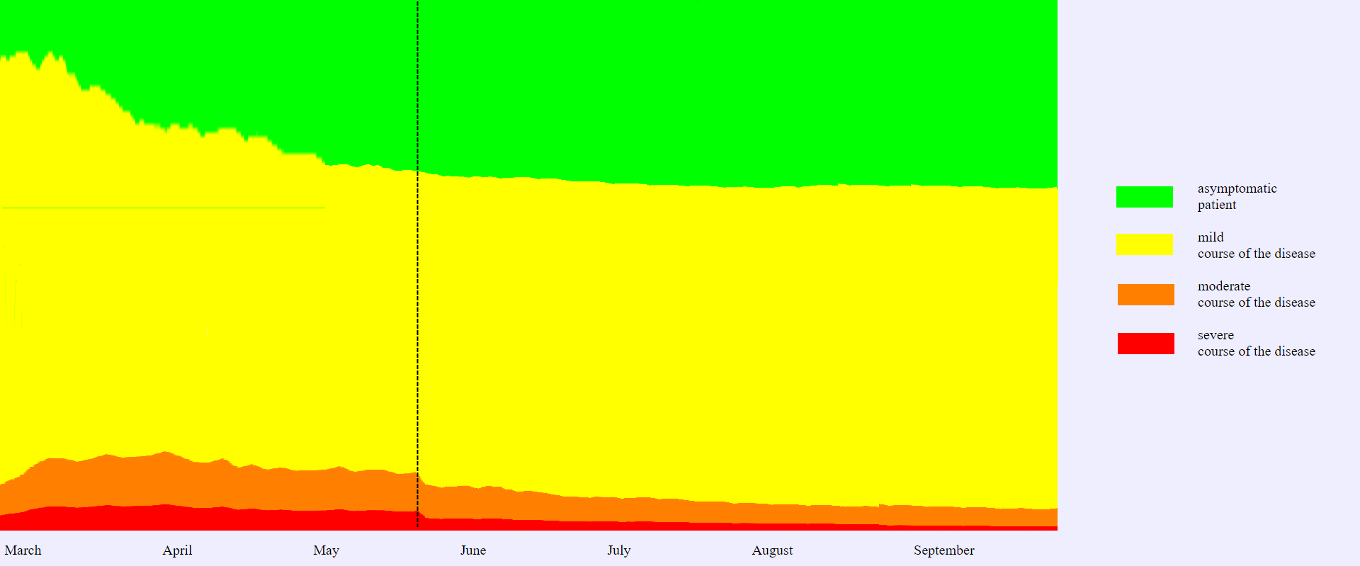
Fig.
7. Graph of structural changes
Let us
consider another example of dynamic changes of structured data. In this case
the observed value
P(t) consists of a large number of
ki
components. An example of such data is the previously considered analysis of
morbidity rate in the context of patients’ age. As practice has shown with the
spread of COVID-19, this parameter is also very important for analyzing the
situation and making management decisions.
Formally, this
task is expressed as follows. As before, we will use the number of patients at
time moment
t
–
INF(t) as the target value. However, we
will consider the value of the composite value
kage(t)
as the number of cases at time
t
at the
age, where
age
is
in the range:
|
|
(8)
|
where
MaxAge
is the
maximum age of infected people.
Visual
representation of such a value by conventional methods (graphs, charts, tables)
is quite problematic as the number of components is high (in the extreme case
age can be a continuous value) [20,21].
Very often, to
analyze and interpret such data, rounding the parameter and switching to
certain ranges are used. For example, the all-Russian operational headquarters
for publications it was offered to replace age parameter with the following
ranges:
·
children,
teenagers, and young people (under 30 years old);
·
middle-aged
people (30-49 years old);
·
people aged 50-59
years;
·
old
people over 60 years old.
However, this
division is very conditional. This is confirmed by numerous publications in
which the age ranges may be completely different. This is due to the fact that
it is quite difficult to identify the most objective ranges for analysis. First
of all, the following issues cause difficulties:
·
the
need for preliminary data analysis and the introduction of additional criteria
for forming ranges;
·
the
potential for changing ranges over time, which leads to unreliability of data
if hard boundaries are introduced;
·
loss
of information content and part of the information due to rounding data and
bringing them to predefined ranges;
·
increase
of time required for data analysis due to the need for an additional step
(selection of range boundaries);
·
difficulties
in arranging border ranges that depend on external influences (for example,
range boundaries may have geographical or other dependencies).
In addition,
it is worth noting that the selection of pre-defined ranges and rounding the
observed value automatically lead the problem to analysis in purely subjective
values, and objectivity of the display results will strongly depend on how well
or unsuccessfully the range boundaries were selected.
To analyze
these data, we offer a slightly different approach. Due to the difficulties in
selecting ranges, we suggest abandoning them and visualizing the data not as
color bands, but as a continuous gradient. To do this, a smooth color change is
compared to the age and the target value graph is filled in according to the
obtained values of the composite components.
The resulting graph is shown in Fig. 8.
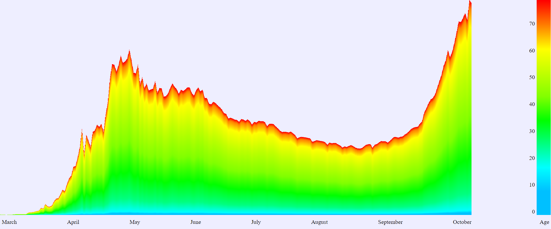
Fig.
8. Graph of showing structured value by means of color markers in the context
of patients’ age
This display
does not require analysis and selection of rounding limits. Data can be visualised
immediately until they are not processed. In this case, the composition
patterns will automatically adjust and display adequately, regardless of any
external or internal influences.
In this paper,
we have proposed a method that combines analysis and visualization of
structured data. Most of the examples in the paper are given on the situation
with COVID-19 development. This is due to the fact that we have tried and
tested this visualization approach on the basis of the corresponding complex.
However, the proposed method of displaying the dynamics of changes in the data
structure in the form of color markers and gradients can be used in absolutely
any areas where there is a need to display the dynamics of composite values,
see and analyze the structure of these values.
1.
Podvesovskii A.G., Isaev
R.A.: Constructing Optimal Visualization Metaphor of Fuzzy Cognitive Maps on
the Basis of Formalized Cognitive Clarity Criteria // Scientific Visualization,
2019, Vol. 11, Num. 4, P. 115-129. – DOI: 10.26583/sv.11.4.10
2.
Zakharova A., Shklyar A.
Basic principles of data visual models construction, by the example of
interactive systems for 3D visualization // Scientific Visualization, 2014,
Vol. 6, Num. 2, P. 62-73.
3.
Bondarev A.E., Galaktionov
V.A.: Generalized Computational Experiment and Visual Analysis of
Multidimensional Data // Scientific Visualization, 2019, Vol. 11, Num. 4, P.
102-114. – DOI: 10.26583/sv.11.4.09
4.
Russell Timothy W.,
Hellewell J., Jarvis Christopher I., van Zandvoort K., Abbott S.,
Ratnayake R., Flasche S., Eggo R.M., Edmunds W.J., Kucharski A.J. Estimating
the infection and case fatality ratio for coronavirus disease (COVID-19) using
age-adjusted data from the outbreak on the Diamond Princess cruise ship, 2020,
https://doi.org/10.2807/1560-7917.ES.2020.25.12.2000256, last accessed
2020/07/10.
5.
Yang L.Y., Yan L.M., Wan
L., Xiang T.-X., Le A., Liu J.M., Peiris M., Poon L.L.M., Zhang W. Viral
dynamics in mild and severe cases of Covid 19.
Lancet Infect Dis, 2020.
6.
Kapoor A., Ben X., Liu L.,
et al. Examining COVID-19 Forecasting using Spatio-Temporal Graph Neural
Networks, 2020.
7.
Zakharova A.A.,
Korostelyov D.A., Fedonin O.N.: Visualization Algorithms for Multi-criteria
Alternatives Filtering // Scientific Visualization, 2019, Vol. 11, Num. 4, P.
66-80. – DOI: 10.26583/sv.11.4.06
8.
Murray C.J.L. Forecasting
COVID 19 impact on hospital bed-days, ICU-days, ventilator-days and deaths by
US state in the next 4 months. IHME COVID 19 health service utilization
forecasting team, https://doi.org/10.1101/2020.03.27.20043752, last accessed
2020/07/10.
9.
Khrapov P.V., Loginova
A.A. Mathematical modelling of the dynamics of the
сoronavirus COVID-19 epidemic
development in China // International Journal of Open Information Technologies,
2020, Vol. 8(4), P. 13-16,
http://www.injoit.org/index.php/j1/article/view/908/874, last accessed
2020/07/10.
10.
Matveev
А.V. Mathematical modeling
of evaluating the effectiveness of measures against the spread of COVID-19. // Natsionalnaya
Bezopasnost I Strategicheskoe Planirovanie (National Security and Strategic
Planning), 2020, Vol. 1(29), P. 23-39.
11.
Kosara
R. Presentation-oriented visualization techniques // IEEE Comput Grap Appl,
2016, Vol. 36, P. 80-85.
12.
Koltsova
E.М., Kurkina
Е.S., Vasetsky
А.М. Mathematical modeling of the spread of COVID-19 coronovirus epidemic in
a number of European, Asian countries, Israel and Russia // Economic problems
and legal practice, 2020, Vol. 2
13.
Wang
D.Q., Guo D.H., Zhang H. Spatial temporal data visualization in emergency
management: a view from data-driven decision // Proceedings of the 3rd ACM
SIGSPATIAL Workshop on Emergency Management, 2017, P. 1-7.
14.
AnyLogic,
https://www.anylogic.ru/, last accessed 2020/10/15.
15.
Jüni
P., Rothenbühler M., Bobos P., Thorpe K.E., da Costa B., Fisman D.,
Slutsky A.S., Gesink D. Impact of climate and public health interventions
on the COVID-19 pandemic: A prospective cohort study.
CMAJ May 08, 2020.
16.
Yang
X, Yu Y, Xu J, et al. Clinical course and outcomes of critically ill patients
with SARS-CoV-2 pneumonia in Wuhan, China: a single-centered, retrospective,
observational study.
Lancet
Respir Med, 2020, Vol. 8(5), P. 475-481.
17.
Borisov
V.V., Kruglov V.V., Fedulov A.S. Fuzzy models and networks. – M.: Hot line –
Telecom, 2012, P. 284.
18.
Rodkin
М.V., Shikhova N.М. Mathematical modeling of COVID-19 epidemic,
an attempt to forecast // Uralian Geological Journal, 2020, Vol. 3.
19.
World
Health Organization. Coronavirus disease 2019 (COVID-19): Situation Report – 38
from 27 February 2020, http://www.who.int/docs/default-source/coronaviruse/
situation-reports/20200227-sitrep-38-covid-19. pdf, last accessed 2020/07/10.
20.
Dimara
E., Perin C. What is interaction for data visualization? // IEEE Trans Visual
Comput Graph, 2020, Vol. 26, P. 119-129.
21.
Robertson G, Fernandez R, Fisher
D, et al. Effectiveness of animation in trend visualization // IEEE Trans
Visual
Comput
Graph, 2008, Vol. 14, P. 1325-1332.